Pandas Plotting 1
matplotlib 사용한 plot 그리기 기초
import pandas as pd
import numpy as np
import matplotlib.pyplot as plt
%matplotlib inline
# setting plot defatult size
%pylab inline
pylab.rcParams['figure.figsize'] = (12, 6)
Populating the interactive namespace from numpy and matplotlib
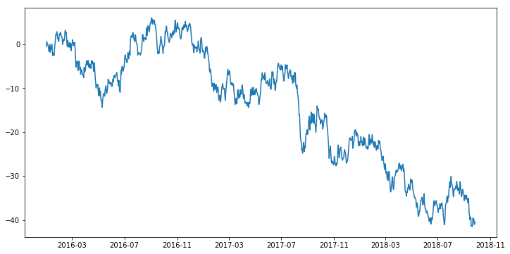
ts = pd.Series(np.random.randn(1000),
               index=pd.date_range('2016/1/1',periods=1000))
ts = ts.cumsum() # row 값 누적하여 합산
ts.head()
2016-01-01   -0.464964
2016-01-02    0.634576
2016-01-03    0.177443
2016-01-04    0.085528
2016-01-05   -0.253183
Freq: D, dtype: float64
ts.tail()
2018-09-22   -40.263403
2018-09-23   -39.797074
2018-09-24   -41.015092
2018-09-25   -40.832436
2018-09-26   -40.470858
Freq: D, dtype: float64
plt.plot(ts)
[<matplotlib.lines.Line2D at 0x268f4bf1828>]
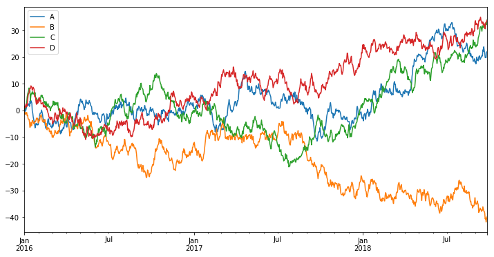
컬럼이 여러 개인 경우
df = pd.DataFrame(np.random.randn(1000, 4),
                  index=ts.index, columns=['A', 'B', 'C', 'D'])
df = df.cumsum()
df.head()
| A | B | C | D | |
|---|---|---|---|---|
| 2016-01-01 | 0.850207 | -0.579718 | 1.218229 | 0.896665 |
| 2016-01-02 | -0.446368 | -1.388548 | 0.560629 | 1.653028 |
| 2016-01-03 | 0.746224 | -0.747689 | 0.734712 | 0.975451 |
| 2016-01-04 | -0.029627 | -1.422848 | 1.710342 | 2.105175 |
| 2016-01-05 | 0.735473 | -1.094084 | 1.792831 | 2.489641 |
plt.figure()
df.plot()               # plt 레이어 위에 컬럼별로 그래프 표현
plt.legend(loc='best')  # 범례 위치를 자동으로 설정
<matplotlib.legend.Legend at 0x268f4bdc1d0>


<matplotlib.figure.Figure at 0x268f4c426d8>
csv, excel 파일로 저장
df.to_csv('test1.csv')
df.to_excel('test2.xlsx', sheet_name='cumsum')
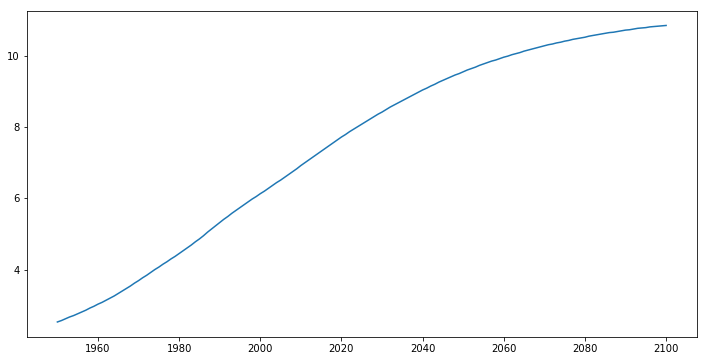
csv 파일에서 데이터 불러오기
df = pd.read_csv('data/population.csv', index_col=0) # 첫번째 컬럼을 인덱스로 사용
df.head()
| pop | year | |
|---|---|---|
| 0 | 2.53 | 1950 |
| 1 | 2.57 | 1951 |
| 2 | 2.62 | 1952 |
| 3 | 2.67 | 1953 |
| 4 | 2.71 | 1954 |
df.tail()
| pop | year | |
|---|---|---|
| 146 | 10.81 | 2096 |
| 147 | 10.82 | 2097 |
| 148 | 10.83 | 2098 |
| 149 | 10.84 | 2099 |
| 150 | 10.85 | 2100 |
plt.plot(df['year'], df['pop'])
[<matplotlib.lines.Line2D at 0x268f4daffd0>]
히스토그램
df = pd.read_csv('data/worldreport.csv', index_col=0)
df.head()
| gdp_cap | life_exp | popul | |
|---|---|---|---|
| 0 | 974.58 | 43.82 | 31.88 |
| 1 | 5937.02 | 76.42 | 3.60 |
| 2 | 6223.36 | 72.30 | 33.33 |
| 3 | 4797.23 | 42.73 | 12.42 |
| 4 | 12779.37 | 75.31 | 40.30 |
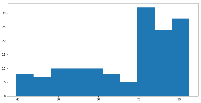
plt.hist(df['life_exp']) # 자동으로 데이터를 나눔 (binning)
(array([  8.,   7.,  10.,  10.,  10.,   8.,   5.,  32.,  24.,  28.]),
 array([ 39.61 ,  43.909,  48.208,  52.507,  56.806,  61.105,  65.404,
         69.703,  74.002,  78.301,  82.6  ]),
 <a list of 10 Patch objects>)
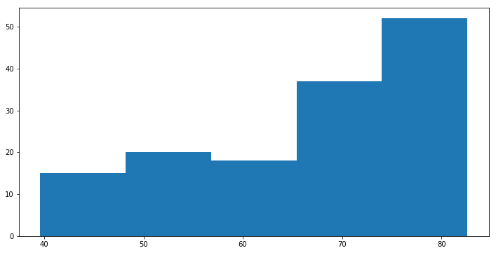
plt.hist(df['life_exp'], bins = 5) # 연속형 변수의 범주를 5개로 나눈다.
(array([ 15.,  20.,  18.,  37.,  52.]),
 array([ 39.61 ,  48.208,  56.806,  65.404,  74.002,  82.6  ]),
 <a list of 5 Patch objects>)
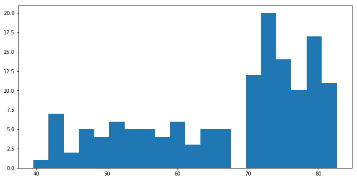
plt.hist(df['life_exp'], bins = 20) # 연속형 변수의 범주를 20개로 나눈다
(array([  1.,   7.,   2.,   5.,   4.,   6.,   5.,   5.,   4.,   6.,   3.,
          5.,   5.,   0.,  12.,  20.,  14.,  10.,  17.,  11.]),
 array([ 39.61  ,  41.7595,  43.909 ,  46.0585,  48.208 ,  50.3575,
         52.507 ,  54.6565,  56.806 ,  58.9555,  61.105 ,  63.2545,
         65.404 ,  67.5535,  69.703 ,  71.8525,  74.002 ,  76.1515,
         78.301 ,  80.4505,  82.6   ]),
 <a list of 20 Patch objects>)
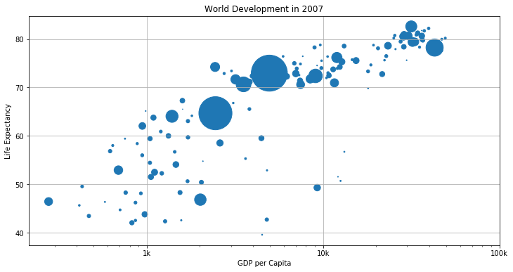
산점도 (Scatter plot)
plt.scatter(df['gdp_cap'], df['life_exp'])
<matplotlib.collections.PathCollection at 0x268f5268f98>
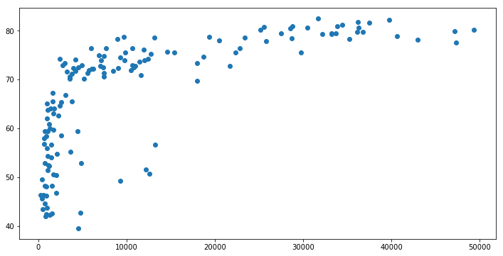
# 인구에 따른 점 크기 표현
plt.scatter(df['gdp_cap'], df['life_exp'], s = np.array(df['popul']) * 2)
plt.xscale('log')               # 단위가 크기 때문에 log 변환
plt.xlabel('GDP per Capita')
plt.ylabel('Life Expectancy')
plt.title('World Development in 2007')
tick_val = [1000,10000,100000]
tick_lab = ['1k','10k','100k']
plt.xticks(tick_val, tick_lab)  # Adapt the ticks on the x-axis
plt.grid(True)